Hi Guys! So it's been a little longer than a week. But as promised here is part two of The Simple Abode's Interior Design Project. If you missed part one (the living room) you can catch up - HERE.
RECAP: Just incase you missed it from part one. You may or may not know Chelsea of The Simple Abode, but if you don't you need to head over to her Instagram because she is the sweetest. And did I mention she has an AMAZING etsy.com shop? Check it out ---> HERE. Chelsea's style doesn't stray far from her name "The Simple Abode." She wanted a simple farmhouse style that really pulled her home together. Not living too far from me here in North Carolina I was able to be very hands on with this project. One of my funnest install days yet!
I designed Chelsea's living room, master bedroom, and master bathroom. And each room underwent major transformation. And today is part two reveal of the project: the master bedroom and bathroom.
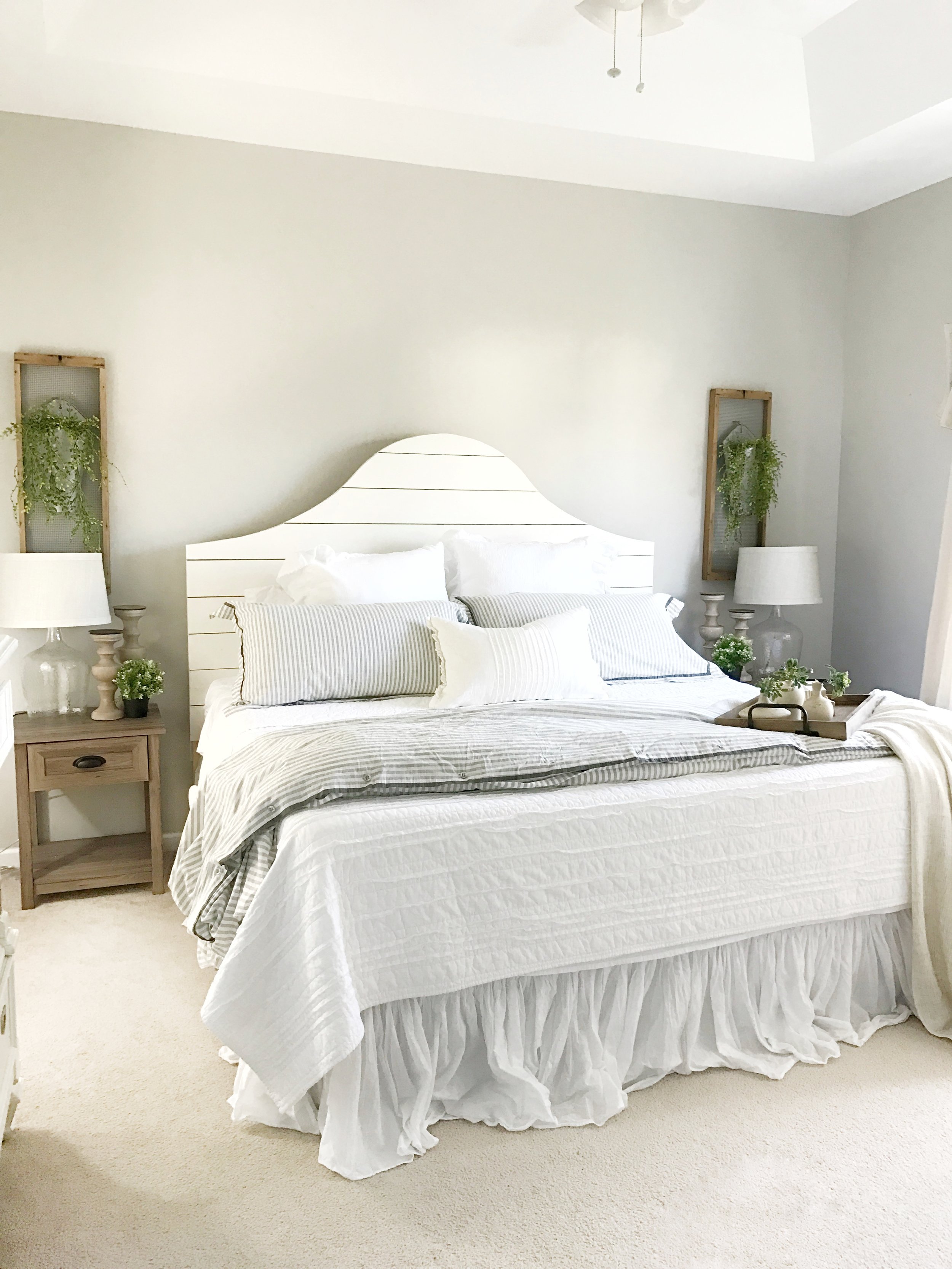
The Master Bedroom... In here the client wanted a space that was simple but still cozy and of course FARMHOUSE. After my client shared some inspiration for shiplap beds- one belonging to Erin of Cotton Stem and the other from the Magnolia Home line, we realized the bed she had envisioned in her head did not exist...YET. Have I mentioned Chelsea's dad is an amazing carpenter?! Because I drew up a custom build plan and he built it. And let me tell you, it is the mother of all shiplap beds. Here are the plans incase you too want to build your very own shiplap bed- CLICK HERE For Build Plans. Tag me in your build if you do!
We swapped out the queen bed for a king, rearranged the layout, added drop cloth curtains on some industrial french pipe rods, added some new nightstands, bedding, and decor. These simple things completely changed the look of the room. Quite the transformation.. don't ya think?!
Below is the style board and design plans for the master bedroom. You can also read all about my client design portals in part 1. Where I explain the design process a little. But the transformation doesn't stop here...
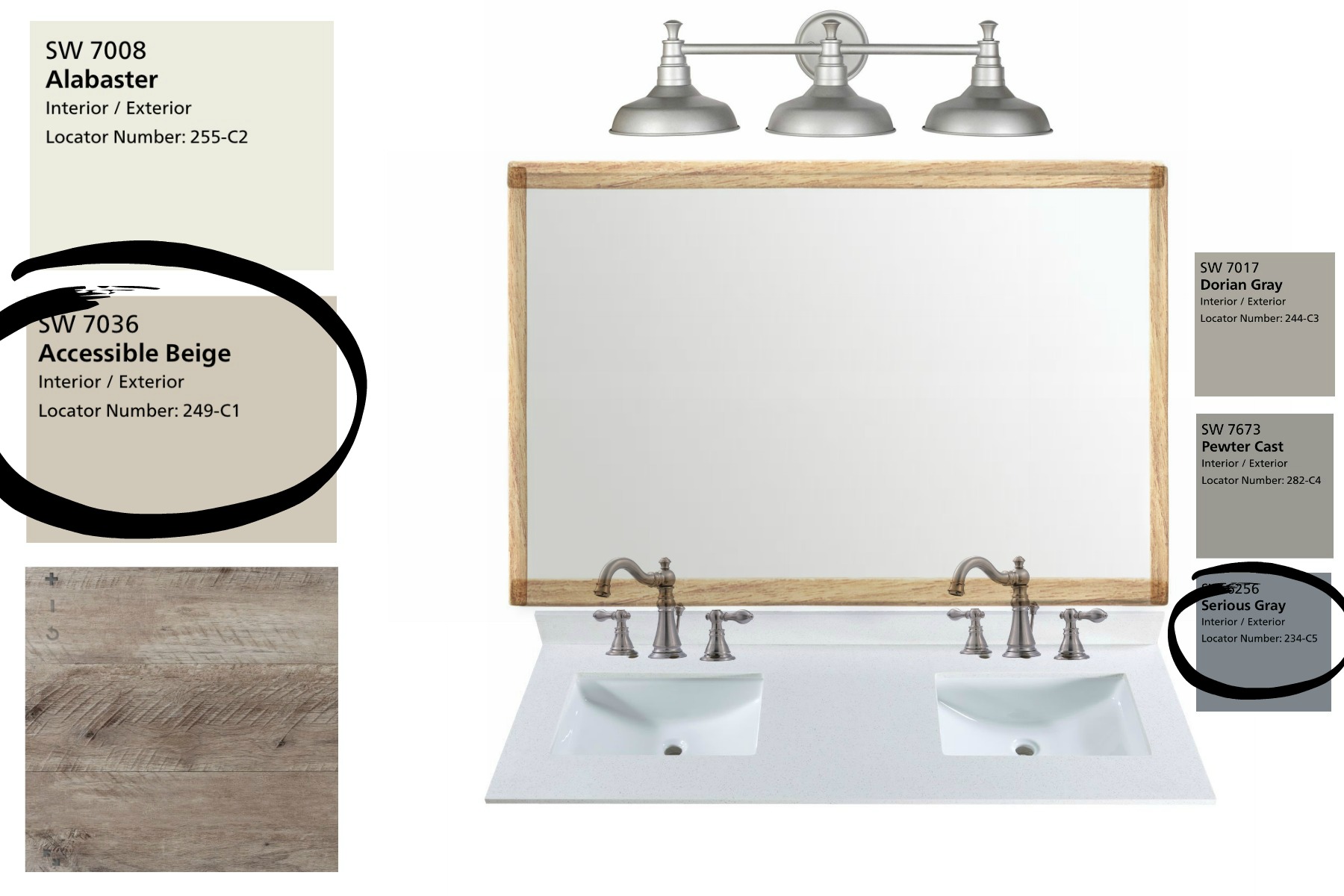
The Master Bathroom... The clients bathroom was pretty builder basic. Linoleum floors, single vanity, and she thought it was just kind of plain. In here we swapped the vanity top for an under-mount double vanity, installed new wood like floors, installed shelves, painted the walls, painted the vanity, framed the mirror, added a farmhouse style light fixture, and added some decor.
By lightening the wall color the space appears brighter and larger. And the painted vanity makes a pop against the new wood like floors. The new under-mount vanity top and the french farmhouse bridge style faucets adds charm and a luxury feel.
I hope you enjoyed this little glimpse into one of my design projects. Chelsea was such a pleasure to work with and I am so happy she allowed me to share our design project with you guys. Many of you have asked why I don't share more of my design projects. And the fact is often times clients request that I do not share their homes/projects on social media or blog, and I always honor their request. But boy when they do allow me to share trust me I will!
As always thank you so much for stopping by today and reading my blog. If you have any questions about anything just let me know! Feel free to leave me a little comment letting me know what you like most about this transformation. I love hearing from you guys! For more information about my design services CLICK HERE.
Be sure to follow me over on FACEBOOK , INSTAGRAM, and PINTEREST to keep up with the latest from me.
With love,


